Client The University of Kent
Format 240 x 190 mm, 96 pages
Skills InDesign, Photoshop and typesetting
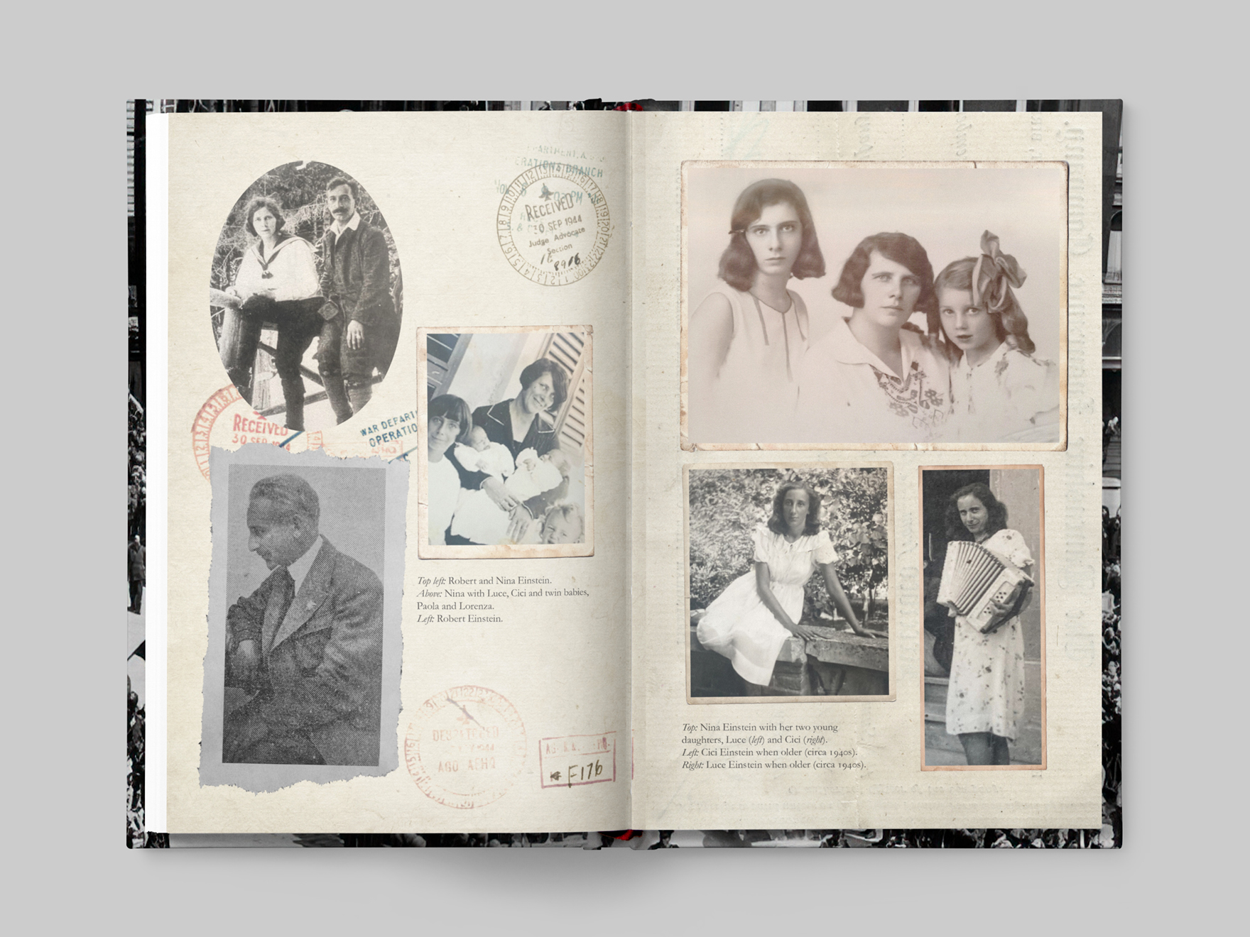
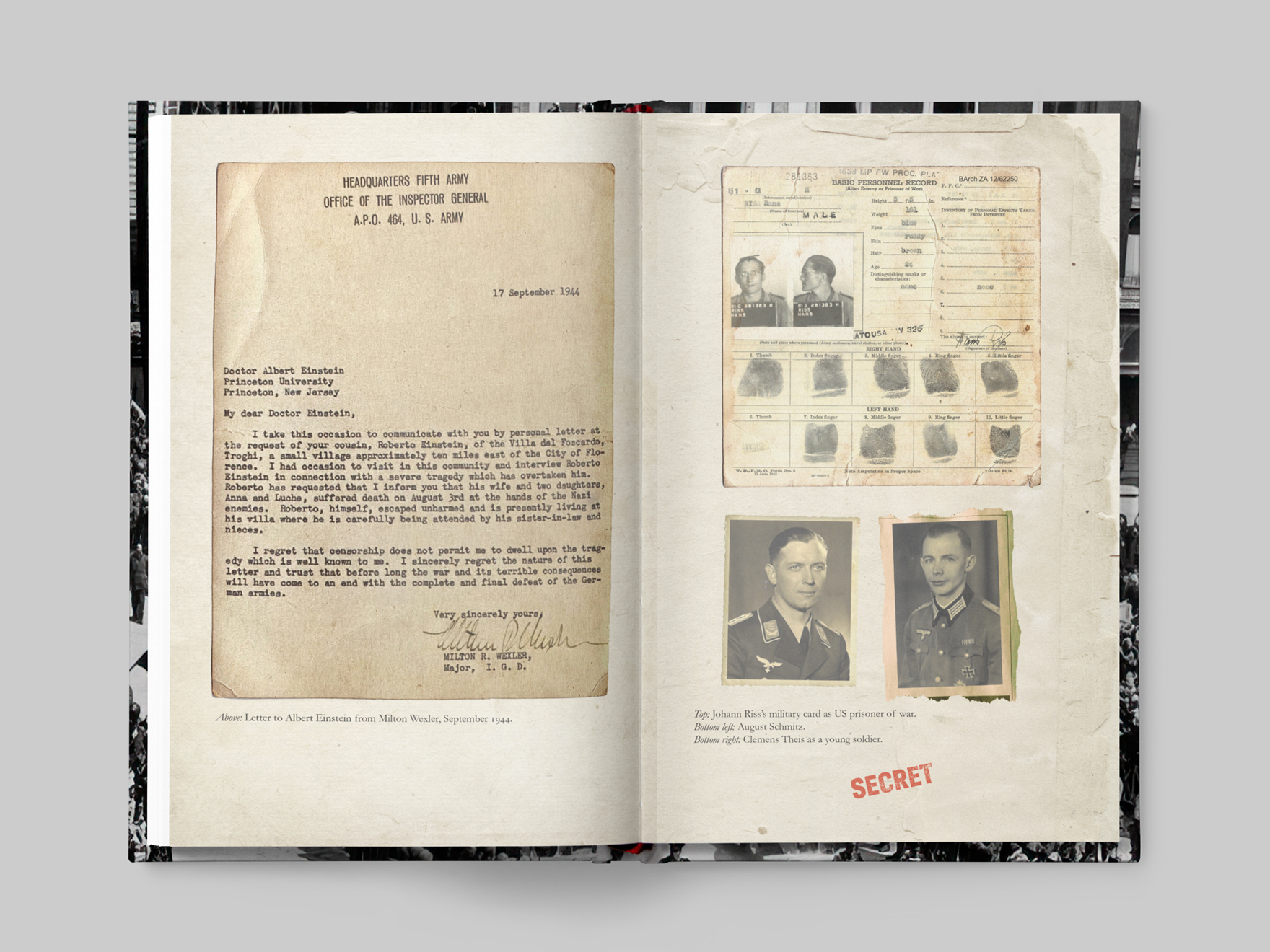
The philanthropy department at the University of Kent contracted me to design their book, Hidden History. The book recounted the story of the university’s fifty-year history of philanthropy. It included case studies of notable donors, details fund raising drives, art collections and the stories behind the campus’s emblematic buildings.
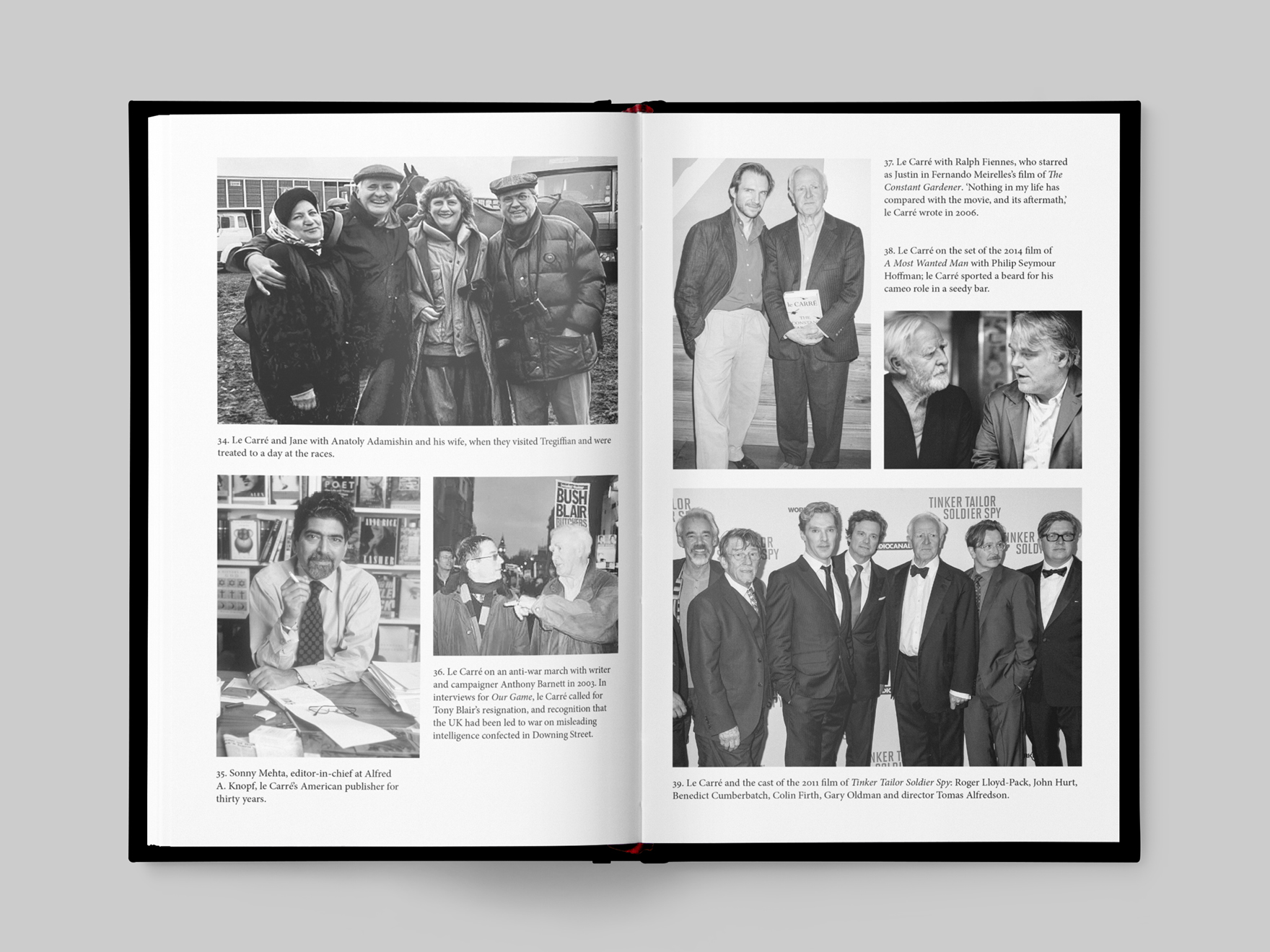
The client required the design of the book to be informative and image heavy. It needed to appeal to a general audience. The design had to work with the university’s design guidelines. This included the use of fonts, colours and logos.
When I started to design Hidden History, I did not know how much text or images I would have to work with. I designed the pages to be simple and flexible, so that I could add more content at a later stage.
I created a one column layout for the text with a wider outer margin. I could place any captions, quotes and smaller inset images into this margin without worrying about disrupting the flow of the main text.
For the front cover, I wanted to play on the ‘hidden’ aspect of the title. I also wanted to provide an overview of the range of subjects covered within the book. I turned the ‘hidden’ part of the title into an outline. Each outline contains a smaller cropped image from a different chapter. I extended this idea throughout the book, using a large outline and cropped ‘hidden’ image in each of the chapter numbers.
To promote the book’s launch, I also designed flyers, posters and social media web banners.
Client Titan Books
Format 279 x 203 mm, presentation only
Skills InDesign, Photoshop, Illustrator and typesetting
The contents of the book reflect the TV show's preoccupation with DNA. The client wanted this reflected in the design. I introduced a DNA logo that could change for each character profile and a DNA code pattern around the edges of some of the pages to add some visual interest. I designed the character profile page to work as either a single page (for a minor character) or as an opener (in this example) for a major character.
Client HarperCollins/Envy Design
Format 160 x 120 mm, hardback
Skills Quark Xpress, Photoshop, Illustrator and typesetting
Envy Design contracted me to work on the spin-off series of The Dangerous Book for Boys. HarperCollins wanted to reformat the original into a series of four smaller format books, adding new content.
I followed the design established in the original Dangerous Book for Boys and introduced new design elements when required.
I worked on three of the books in the series – Things to do, Wonders of the World and Facts, Figures and Fun.
Client New Holland Publishers
Format 245 x 190 mm, 160 pages
Skills Quark Xpress, Photoshop, picture research and typesetting
The 101 Weekends in Europe series were guide books for weekend activities in Europe. The series included 101 Weekends in Europe, 101 Adventure Weekends in Europe and 101 Romantic Weekends in Europe.
I established the original design for the first book, 101 Weekends in Europe. Some entries comprise two pages, others only one. I designed a layout that worked for either, allowing the one hundred and one entries to fit into the overall page extent. My design also allowed room for section openers for each country, a foreword, introduction and an index.
I designed the layout of the book to be clean and simple. Each entry has a coloured sidebar, which appears on the outer margin of the page. This sidebar contained the entry number for easy reference, along with facts and other relevant information about the country. I carried out my own picture research and found striking images for each entry.
After the success of the first book, I worked on the next two, implementing the design I had established.
Client Fall River Press
Format 320 x 305 mm, 224 pages
Skills Quark Xpress, Photoshop and typesetting
Classic Steam is a collection of photographs depicting North American rail travel from the classic age of steam trains. This was a picture-heavy book and my brief was to make the most of this photography. The images varied in quality, so I used a layout that allowed me to mix images at different sizes. While most of the photography was in black and white, I created some variety by breaking up the pages throught the book with double-page colour features.
Client Quintet Publishing
Format 150 x 150 mm, 360 pages
Skills Quark Xpress, Photoshop and art direction
The two books, 500 Cupcakes and 500 Cookies, were the first in the ongoing 500 recipe book series. I was responsible for the original concept and design of the series.
My brief was to design a stylish small format, practical book series. The client also wanted the books to possess gift appeal. Each book would contain five hundred recipes and over sixty photographs. I worked out a layout that allowed for the one hundred base recipes, photography and four hundred variations, to fit within the page extent.
It was a challenge to photograph over sixty cupcakes or cookies and make them all look interesting and different. I worked with the photographer, Ian Garlick, and we were able to use different props and coloured backgrounds to create a unique look for each recipe.
Client Quintet Publishing
Format 228 x 190 mm, 192 pages
Skills Quark Xpress, Photoshop and art direction
The client wanted Asian Flavours to look like a contemporary cooking book. Their initial plan was to reuse photography from their back catalogue of cookbooks. I argued that it would be more consistent to maintain one style of photography throughout the book. It would make the book look modern and add value.
I was responsible for the design and art direction of Asian Flavours. I wanted the book to be photography led, so I commissioned Ian Garlick for the photography. By working together, we were able to make each recipe look unique and appetising. We achieved this through the use of different props and backgrounds.
Client Headline
Format 198 x 152 mm, 240 pages
Skills InDesign, Photoshop, picture research and typesetting
Eat & Drink is a collection of food writer and television presenter Olly Smith’s favourite recipes and food-related stories.
The original brief was that the book would be text only. This expanded into an illustrated, two-colour book. The client wanted the design to look like a notebook. This was to match the author’s writing style. Olly supplied his own hand-drawn artwork, and the client was keen to incorporate them into the design.
Client Hotel Chocolat
Format 198 x 145 mm, 80 pages
Skills Quark Xpress, Photoshop, picture research and typesetting
Hotel Chocolate required a design for a promotional book. Chocolate Unwrapped was a mixture of articles and photography, showing the history and art of chocolate making. It was a picture-heavy book, using images from their extensive photography library.
To discuss your design requirements, please contact me via the form below.
* Required fields
Please provide me with some details about your project. This will give me an idea about what your business/product is about, and what you hope to achieve for the end design. It will also give me an idea of the timescale involved.
Please including the following:
If you have a set budget, I can usually offer a solution that fits within it. If not, I can provide an estimate outlining some options of what I can offer, along with the costs involved.
I look forward to hearing from you.
All correspondence and contacts are treated as confidential. I only store emails relating to ongoing or past design projects. I do not sell, distribute or lease personal information to third parties. From time to time, I may contact an existing client or follow up on a past enquiry regarding potential design projects. By contacting me, you consent to these terms.
This website uses the cookie DYNSRV. This is added by our load balancer to track which web server to send the visitor to. Its purpose is to improve the performance of the website. This cookie terminates when you close your session. No other cookies are used on this website. I do not track my visitors.